

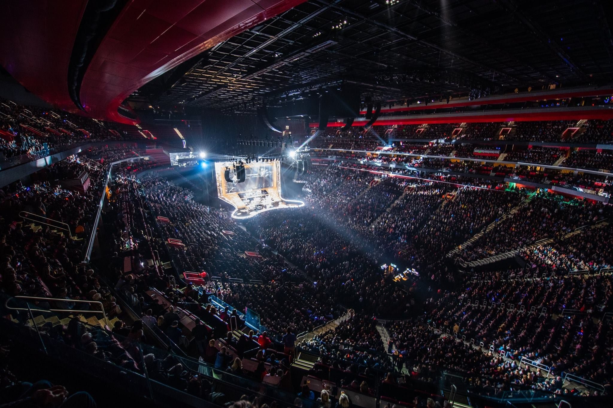
Ticketmaster’s live event business thrives on timing, pricing, and data.
As Lead Product Designer for Revenue and Demand, I reimagined how sales teams and clients plan, price, and sell out events—from arena tours to playoff games.
My mission is to make complex sales strategy accessible, actionable, and profitable for everyone involved.
Approach
To truly understand the challenges, I embedded myself with Ticketmaster’s internal pricing teams and external sales analysts—shadowing their day-to-day, mapping decision flows, and surfacing the friction in our legacy tools.
I worked both B2B and client-facing, running agile sprints with cross-functional teams in Chicago, LA, London, and virtually. Quarterly, I joined in-person planning sessions and biannual strategy summits with executive stakeholders to keep our roadmap sharp and future-focused.
A core part of my process was partnering with our data science and engineering teams to automate manual tasks and surface powerful insights—making data not just available, but indispensable.

The Problem
When I joined Ticketmaster’s pricing team, I walked into a world where changing the price of a single seat meant typing into a command line and crossing your fingers. The process was glacial, error-prone, and discouraged anyone from trying to price seats individually. The result? Teams believed granular pricing was a myth—and leaders quietly agreed.
Because the native tools were so limiting, pricing teams either hacked together makeshift solutions or turned to third-party products just to bridge the gaps. All the while, real money was evaporating—nobody knew exactly how much, but it was clear revenue was falling through the cracks.

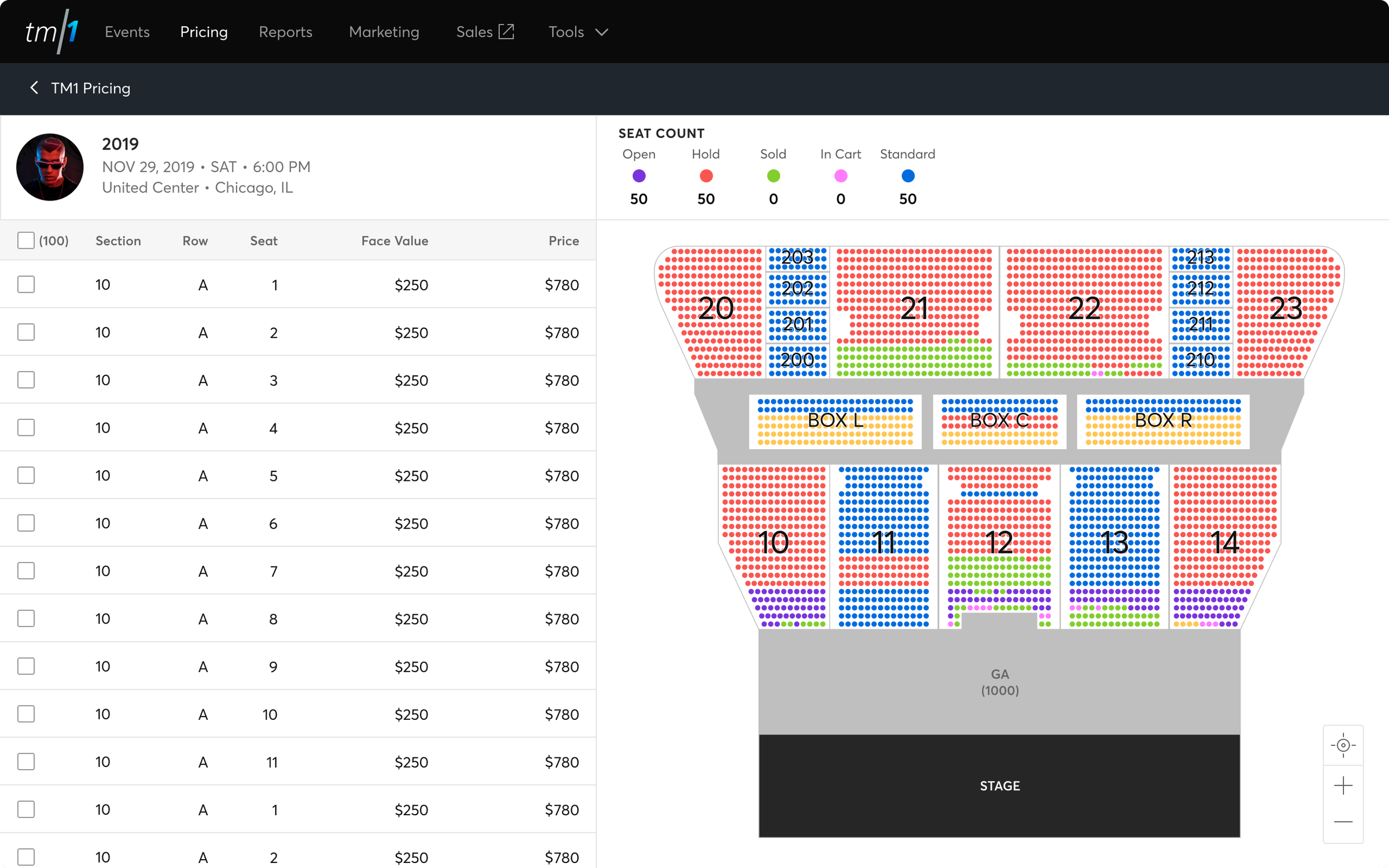
Clunky Pricing
No individual seat pricing. Adjustments were erroneous. The system was allergic to precision.
Zero competitive insight. No way to compare prices with third-party sellers — no visibility to the market.
No seat map. You couldn’t visualize what you were doing, let alone price intuitively.

Organized Chaos
Finding events was a challenge. Navigation was neither fast nor friendly.
No drill-down capability. Want to target a section, row, or seat? Best have the arena fax you a seatmap.
No cross-event visibility. Tracking prices across several events or venues? Good luck.

Flying Blind
No early performance signals: You only learned which events did well after they were over.
No strategic guidance: Tools to optimize pricing or fill venues didn’t exist.
No history: Year-over-year event data wasn’t captured or surfaced.
An outdated pricing system without a UI didn’t just waste time — it cost money.
Bulk pricing left profit on the table. Missed signals hid opportunities. The absence of analytics made improvement impossible.
To make matters worse — the errors Ticketmaster’s side were damaging to the company’s reputation and had to be paid out in lawsuits, all due to a clunky manual process.
I didn’t want to patch up the old. My goal was to completely rethink pricing from a designer’s perspective: restore clarity, empower intuitive organization, offer real insight, and let every team member see—and realize—the full value of every seat and every event, in real time.
And with over 6 years of my software, designed from scratch on the Pricing program, the results speak for themselves.
The Solution
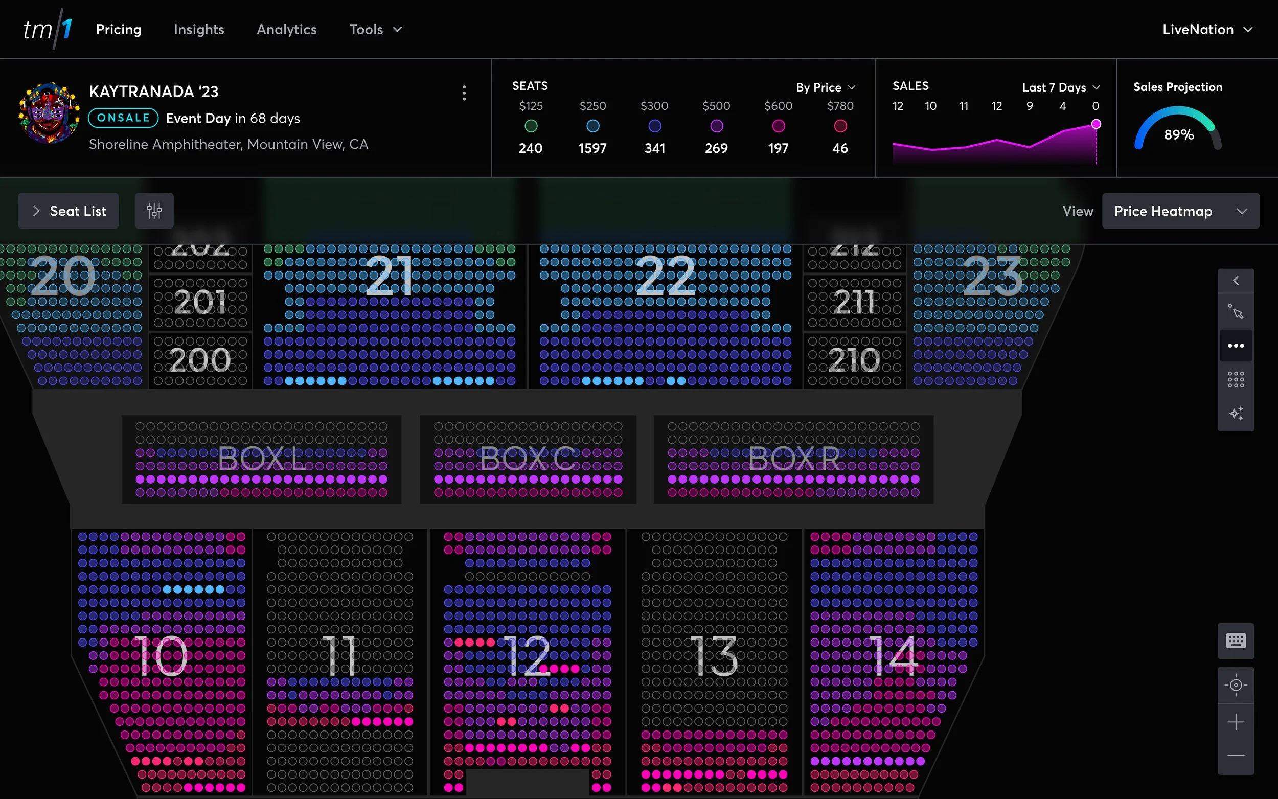
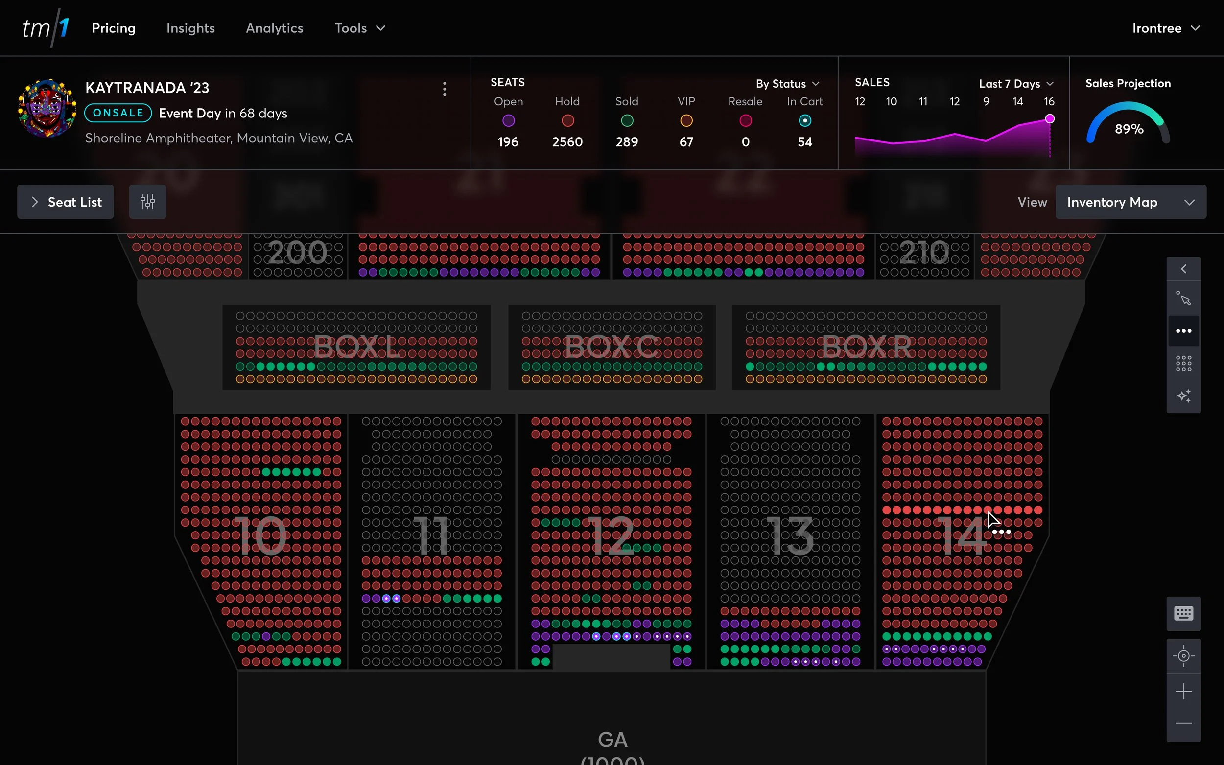
A Pricing app for every event and every pricer.
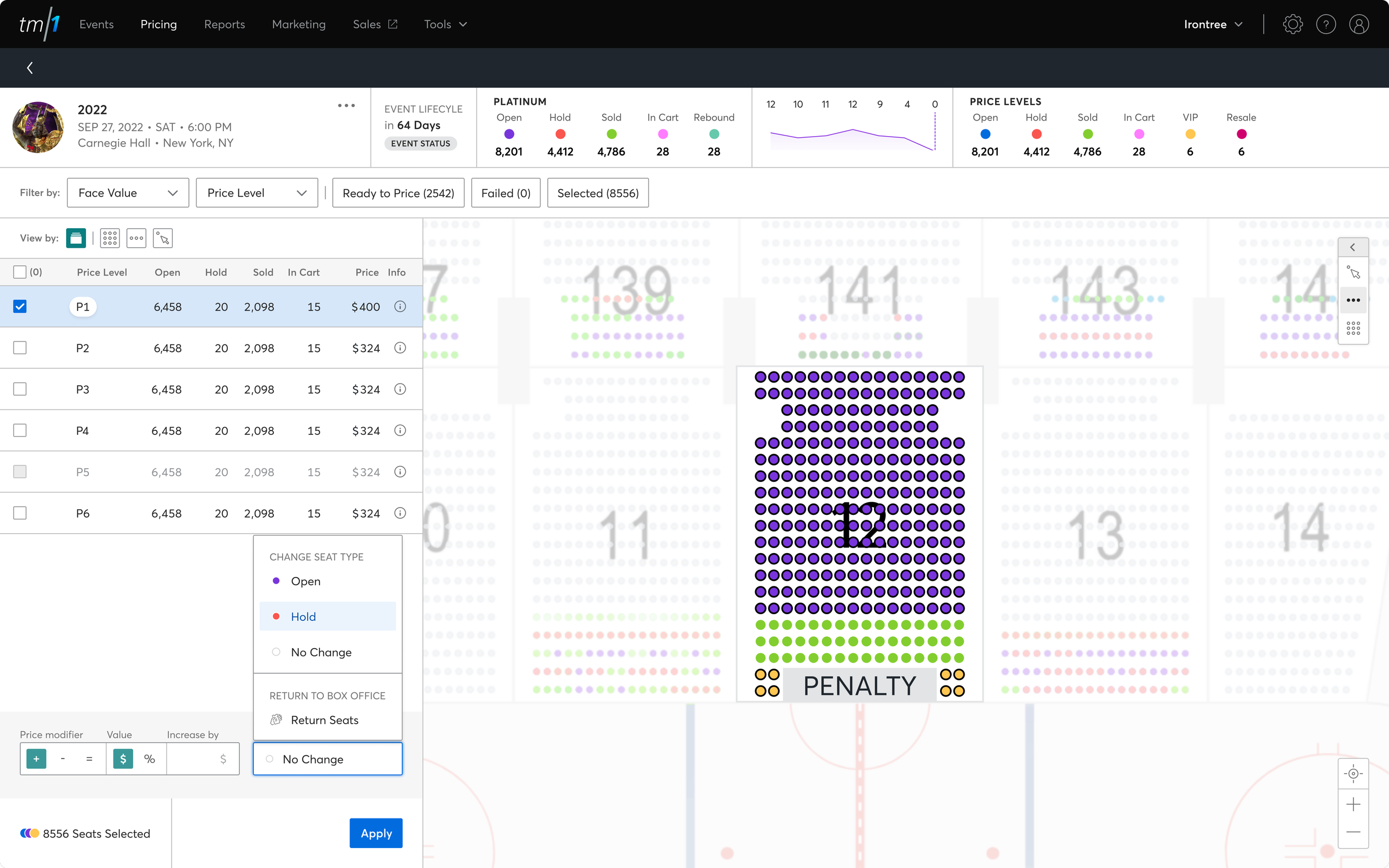
All your seats — in one list. Sort them by section, row, seat or group them how you want them.
Easy to use selection tools for selecting and pricing seats. Price as manually as you want.
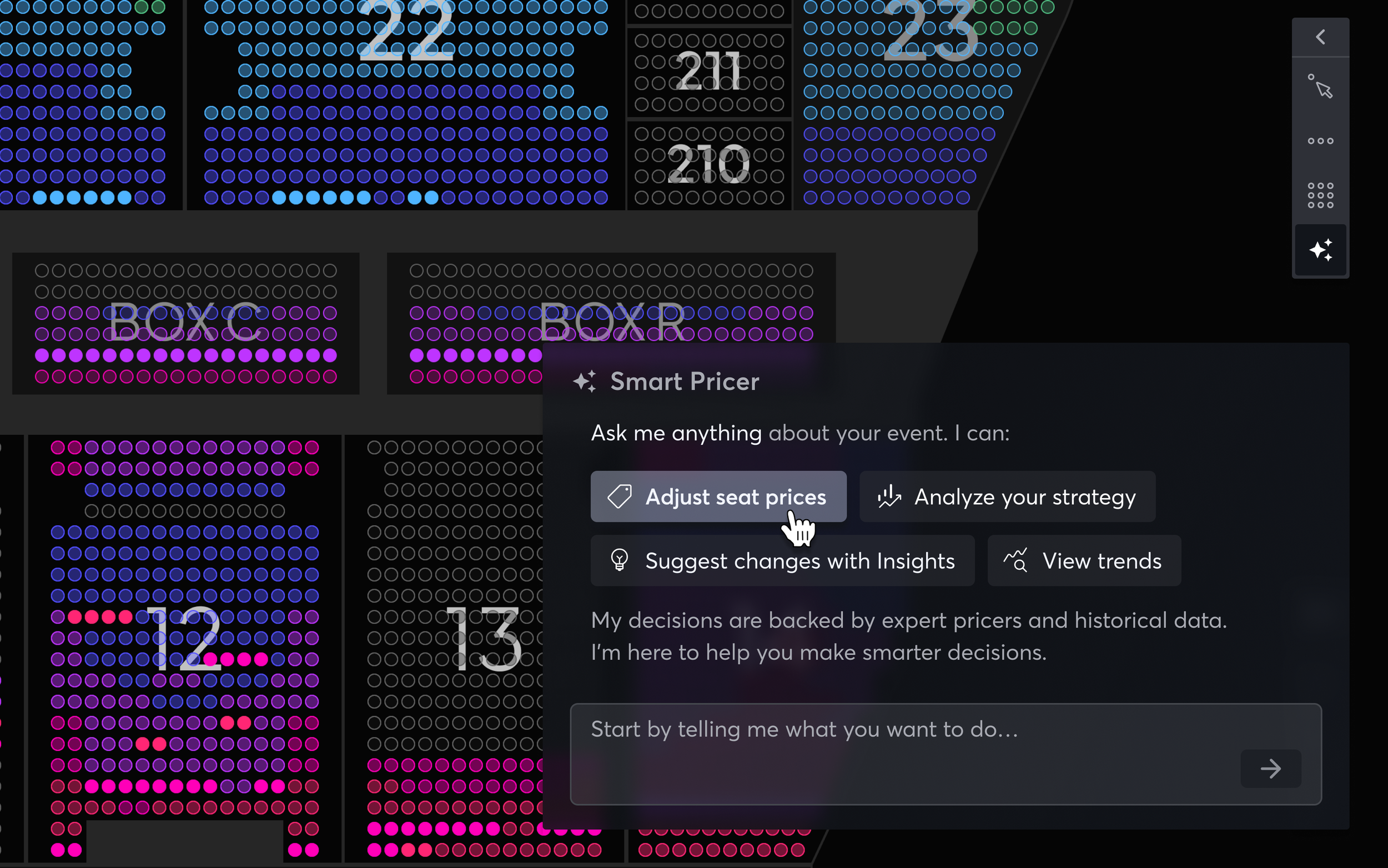
Or let the assistant price for you. The Smart Pricer makes better pricing decisions — using AI insights powered by the decisions of expert pricers in the field.
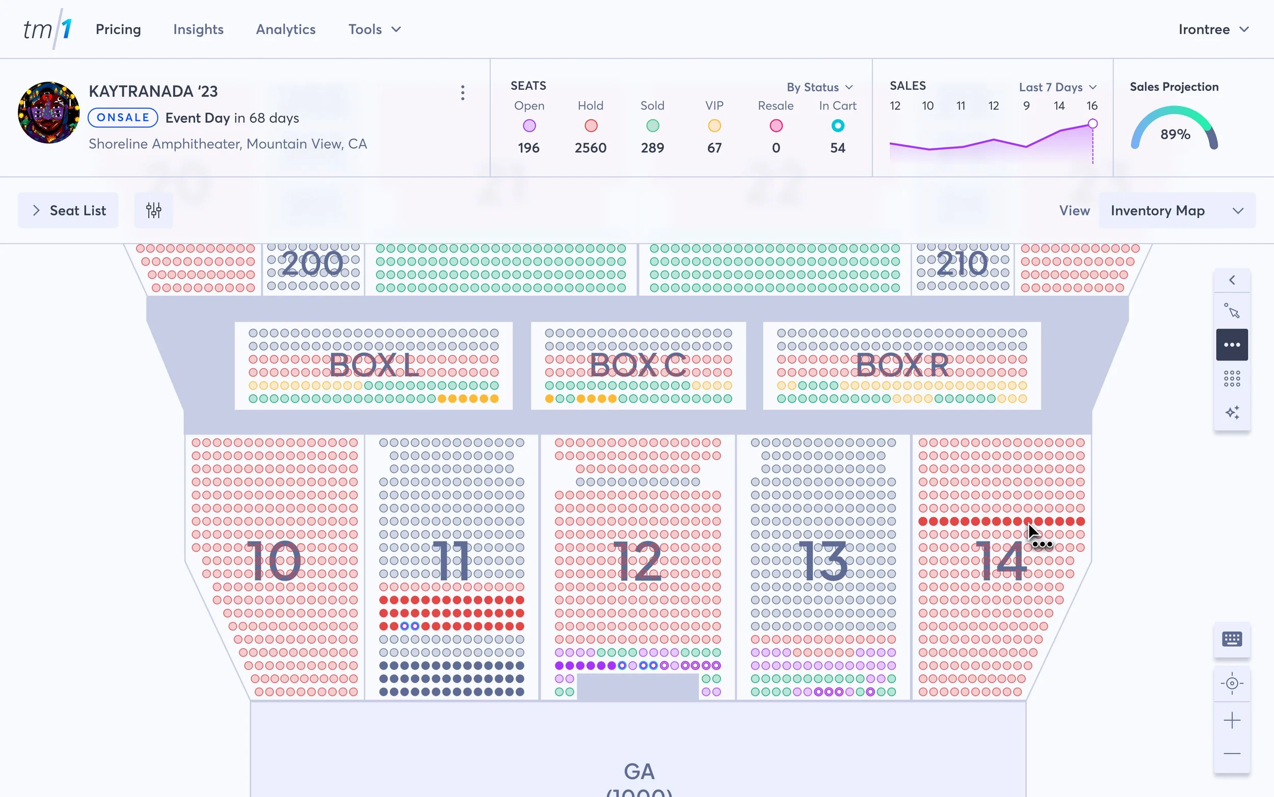
See the difference. Use view modes to get a better understanding of your inventory and your pricing strategy.
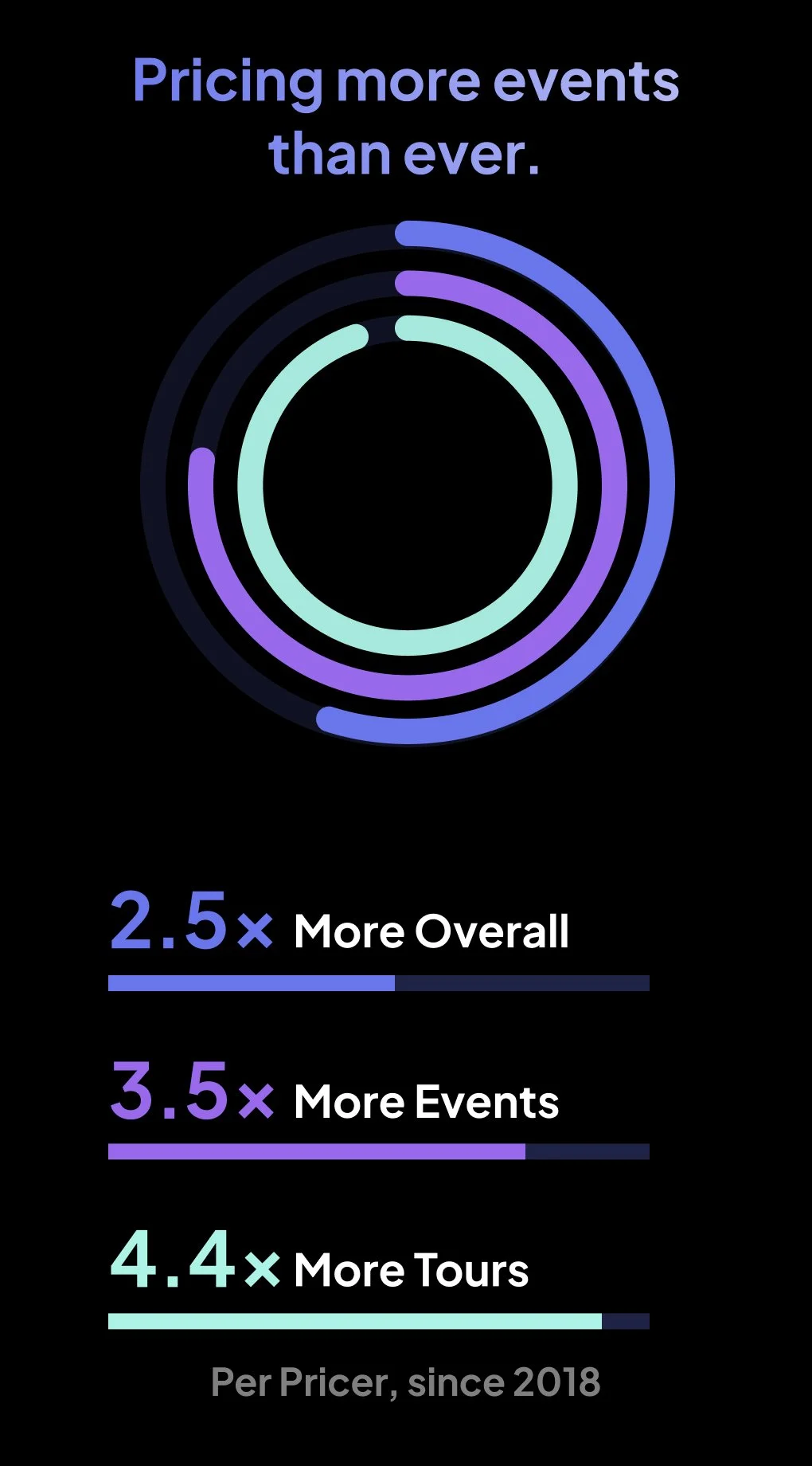
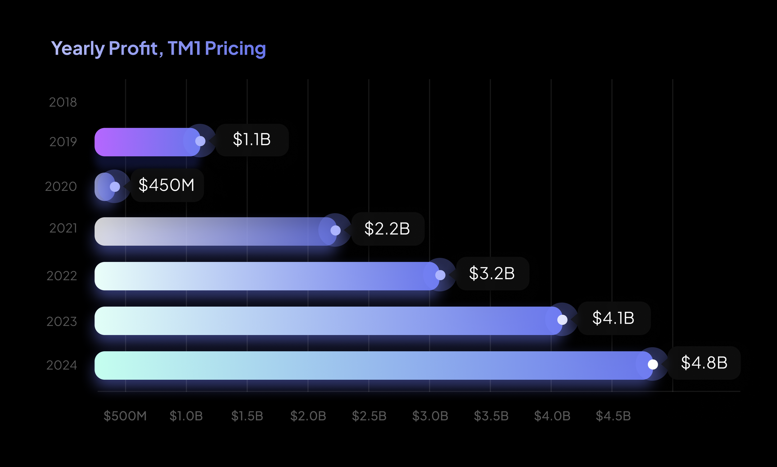
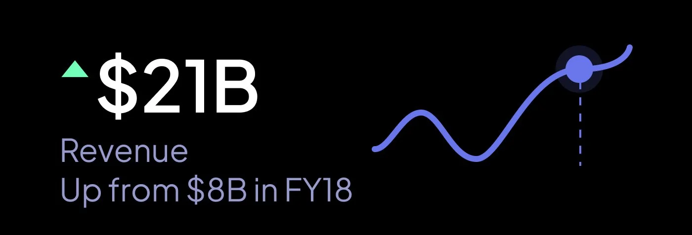
Over six years, thousands of hours of research and development, and over $21 billion in revenue generated, this tool evolved from a small pricing tool into the pricing expert.
Year 1 - Grossed $1.1B
Year 4 - Grossed $3.2B
Year 6 - Grossed $4.8B

Year 6 - Grossed $4.8B
Impact
This project proved the impact of aligning data, design, and strategy. By making premium pricing accessible and actionable, we unlocked new revenue streams and set a new industry standard.
Years later, TM1’s Premium Pricing remains central to Ticketmaster’s continued growth—demonstrating how thoughtful innovation can reshape an entire industry.